
Use These 7 Tools For Breakthrough Quality And Performance In 30 Days
By Ben Locwin, Ph.D.

The final article (really) in Identifying And Resolving Errors, Defects, And Problems Within Your Organization — a series on operationalizing proper improvement techniques
Welcome to the sixth and final installment of this series on the proper selection and use of tools to help you improve Quality within your organization. As you’ve seen to this point, the quality of products or services doesn’t improve just because the company wants it to, or because there is a separate department named “Quality,” full of people on the payroll. Quality is a discipline. And being a discipline, it requires continuous, effortful, and thoughtful practice — both to improve the current state of the organization’s outputs and to properly plan for market forces of the future that may necessitate a fundamentally different set of outputs or customer (or regulatory) expectations.
I’m going to tie together the previous five articles in this series with this treatise on the 7 Tools of Quality. If this is your launching point for this series, each of the previous articles are easily available to you here:
- How To (Better) Identify And Analyze Manufacturing Trends In Your GxP Organization
- When To Use A Fishbone Diagram … And Why You Should Do It More Often Than You Think
- Fault Tree Analysis: Uncovering The Root Causes Of More Complex Problems
- Solving Problems More Effectively Than Sherlock Holmes: The Contradiction Matrix
- “Work Harder” — And Other Common Ways To Completely Miss The Mark On Quality
Author’s note on heroics: In all actuality, heroism should be defined as acting during an event with a low probability of survival. Don't let heroics be how you run your quality systems, seeking to survive against all odds. Instead, stack the deck in your favor by implementing what I've shown you in this series. In the case of any good business in a highly-competitive market, the reward for success is that you get to play again.
The 7 Tools Of Quality
1. The Check Sheet
The check sheet is your basic data collection tool in the form of a manual tally of what’s going on. It may seem too simple to be true, but in most cases, businesses don’t know the actual data underlying their most fundamental problems, where those problems are occurring, and with what frequency.
The check sheet allows you to gather data to answer the following questions: “What types of defects are occurring?” and “What’s the relative frequency of the defects’ occurrence?”

Looks like there’s some not-very-high-quality painting going on here; though you’ll never know this until you measure!
Author’s tip: Identify the issues in your organization that are causing errors and defects. Then have employees — who work in the field with the real data — collect these data thusly. If you try to get these data second- or third-hand, you’ll be committing a host of logical fallacies that I’ve explained here.
You can also plot the defect data on a concentration diagram, which I also refer to as a visuospatial analog of a checksheet. Using a concentration diagram (like the one below), you can build up in a spatial layout (or even temporal/time-based) of where (or when) defects and failures are occurring.
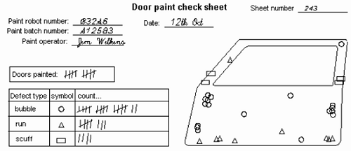
In some cases, I would advocate for anonymity in collecting check sheet defect data, because it may lead to more accurate and true reporting. But, there could be value in having the accountability of the data recorder captured in each iteration of the check sheet. What you’re trying to do is build up a tally of defects by category or type, to help you understand underlying causality in your business and operational processes. Think: reasons for document review/approval delays, missing materials at point of use, missed manufacturing targets, failed batches, administration delays, etc. If you can think it, you can measure it. (But just remember my other protip: Just because you can measure it doesn’t mean that you should!)
2. The Flow Chart
The flow chart is an engineering favorite, and for good reason: It allows you to document the repeatability by which you expect a process to recur, lest you expect it to fail. The first formal presentation of flow charts was in 1921, and for a century they’ve been indispensable in process engineering work. Flow charts are algorithmic in nature when done well; that is, they should be unambiguous specifications for how to solve a problem.
Basically, you begin with a terminal shape and plot process steps deterministically in a time-based way, using flow arrows representing the flow of time (typically pointing rightward or downward, depending on the chart’s orientation). Each input and output has its own shape to distinguish it from other steps in the process, and decisions (to do this or this, yes/no, etc.) are represented by a diamond shape (called a rhombus, by the way, for you fans of Euclid).

It helps a great deal to include flow charts in your standard operating procedures (SOPs) or work instructions (WIs) — because if you can’t visualize a “standard,” then why are you even calling them standard operating procedures?

Neuroscientifically, there are a lot of similarities between flow charts and how we as humans ritualize behavior. Just think about your morning routine for getting ready for work — if you discombobulate any of the steps or try to disorder or rearrange them, it really puts an incredible amount of pressure on your prefrontal cortex and executive brain functions because you can’t operationalize your basal functional operations.
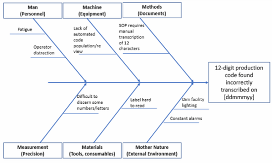
3. The Cause-And-Effect (Fishbone) Diagram
As I’ve expanded upon in great detail in my suprapreantepenultimate article, the fishbone diagram helps to list the main and major causes that lead to some effect, whether untoward or not. This allows you to arrange and categorize your thinking for further problem-solving.

It’s unlikely that simply using a fishbone diagram in isolation will allow you to fully understand and solve your problem(s) to the level of prevention needed. But that doesn’t stop people from relying on the fishbone diagram alone; in fact, it happens all the time across this (and many other) industries. So be better than your peers and competitors — don’t just perform a fishbone diagram as part of a deviation investigation, assign CAPA based entirely on this one analysis, and then try to close the CAPA. Your issues are only superficially addressed in this case.
Here is a fishbone diagram I created to help you start:
4. The Histogram
A perennial favorite of mine, the histogram allows you to wield your data armamentarium to a greater degree. Named from the Greek histos (bar, mast) because the bars resemble the masts of a ship, a histogram is NOT a bar chart (though it is a chart with bars!). Instead of the x-axis pertaining to another variable, such as time, a histogram’s x-axis corresponds to the intervals, or bins, of data being measured. With bins of equal size, the heights of the bars then represent the frequency of data cases in each bin.
Wondering about what the architecture of your data can tell you? Plot it on a histogram and allow it to help guide your investigation.
Maybe you want to know how many documents are arriving per minute so you can more effectively allocate resources. In that case, knowing what your data are telling you is the first step:

The data in the chart below is from the 2000 U.S. Census on commuter (travel) time to work. The vast majority of commute durations are about 35 to 40 minutes.


The shape of your data’s histogram can tell you a lot about the underlying process(es) which manifested the as-seen results:

Stratification can also help you uncover interesting features of your underlying data:

When everything is combined together, you lose the ability to distinguish which effects are due to which factors. Think about separating data out by product line, shift, etc. to uncover deeper truths about what is really going on.
In the example below, a histogram can tell you a lot about the underlying nature of the data. The winning times for the Sydney Marathon cluster around about 136 to 138 minutes in the years 1960–2007 in the histogram on the left side. However, the time series plot to the right-side retains the time-ordering of the data — and indicates the potentially that the winning time has been decaying upwards for a few years. Plotted on a control chart would give you a better indication of whether your gut reaction was accurate.

5. The Pareto Chart
Named for the Italian economist Vilfredo Pareto, the Pareto chart provides a very interesting approach to visually show how a small number of “somethings” often contribute disproportionately to something else. Often referred to as the 80/20 rule, Pareto himself used such methods to plot income distribution and noted that a small proportion of individuals controlled a large majority of the total wealth (i.e., not a normal distribution or a rectangular distribution). Income tends to follow one of these “power law probability distributions” — as do many other things, so much so that business texts fell in love with the idea of 80/20 in the 1980s. You are guaranteed to have some of these so-called Pareto relationships within your organization. For example, out of the millions (or more!) of things that could go wrong and cause defects in your company, there are typically a “critical few” that have outsized influence and do the majority of the “causing.” Find those things and correct them.

A Pareto chart is a combination chart with bars in descending order of frequency, showing the relative proportions, as well as a superposed line plot that tallies the cumulative contributions of each category rightward.

For example, in determining critical process parameters (CPPs), not everything has the same standardized effect size. In the example above, temperature and pH are absolutely more influential. The takeaway: Some causes have outsized influence when compared with other contemporaneous factors. Don’t treat them equally.
6. The Control Chart
Control charts, sometimes called process behavior charts, are line plots used as part of statistical process control (SPC) to determine if a measured parameter (typically within a manufacturing or business process) is “within a state of control.” In the parlance of control charts, language and nuance matter, and something being “in control” (or not) is based upon its performance against an accepted rubric of statistical requirements (including the so-called Western Electric, Nelson, Wheeler, or other “run rules” for detecting signals). Control charts have been used since the late 1920s, and even very early in their implementation, their application taught engineers and scientists about the incredible value of reducing variation from production processes.

Example of a type of control chart called an “I Chart” (for “individual” values).
Here are the basic anatomical components of the control chart: The data points themselves represent the statistic of interest and are plotted in a time-based way. There is a centerline, which represents the average (mean) of the data points. Upper and lower control limits (UCL and LCL) are calculated, which indicate limits that process data points are statistically unlikely to exceed (either upper or lower).


Above are a couple different manufacturing and manufacturability examples. Using process behavior charts can improve your behavior with respect to “how” you respond to outputs from your processes.
There are a few different methods for establishing control limits and alarm limits (what are called “run rules”), but the basic premise is that control limits are there to set goalposts of about 99.73 percent. The assumption is that, when a process is allowed to run — without tinkering — 99.73 percent of the outputs should fall within these control limits and would be called “common cause” variation. Any oddity in output that exceeds the upper or lower control limits is termed a “special cause” variation. Please take a deep breath, though, and remember that because we’re talking about probabilistic concepts and how they pertain to quality control, the above calculus also necessarily means that if you let an “in control” process run 1,000 times, you would expect that you would have about three (3) data points exceed your control limits based solely on chance. That’s why interpreting the results of your processes requires you to use your anatomically-located false alarm detection tool (i.e., your brain).
The bottom line is that increased variation means lower overall quality and an increase in costs, so any special cause variation identified should be immediately resolved. There are whole textbooks and tomes devoted entirely to control charts, so I can’t possibly include all of the relevant details here. (For example, the control limits as originally designed were set based on Chebyshev’s inequality, the Vysochanskii–Petunin inequality, and estimates from the normal (Gaussian) distribution). To put these in practice, if you haven’t done so already, work with someone in your organization and then begin to visualize your data using this tool. You’ll learn much more than you thought you would about your processes and their behavior.
Another thing to consider when you use process behavior charts: Continuously chasing nonconformances by process adjustments (instead of improving the overall process) actually increases variation and reduces overall quality. Don’t do that. I see it all the time, and it’s basically indicative of process owners not understanding anything at all about Quality.
7. The Scatterplot
A scatterplot is a quality tool that allows you to plot data on Cartesian coordinates to gain an understanding of the relationship between one variable and another in two dimensions. (You can also correlate more and more variables, which would give you a scatterplot in three or more dimensions, but I’ll stick with two variables for this discussion here). If a parameter exists that may systematically act upon the other, it is called the independent variable (or control parameter) and is customarily plotted along the horizontal axis. The dependent variable is then customarily plotted along the vertical axis. If no dependent variable exists, either type of variable can be plotted on either axis, and a scatter plot will illustrate only the degree of correlation (not presumed causality) between two variables.

The Old Faithful geyser in Yellowstone National Park has two major “flavors” of eruptions: smaller eruptions and larger eruptions. And there appears to be somewhat of a relationship between which eruption will occur and the waiting time between eruptions — longer wait time between tends to be associated with a larger eruption.
Scatterplots can show you visual relationships between two variables, within which you can also show a confidence interval. Typically, there is also a “best fit” line (trendline) that’s plotted as well. Unfortunately, the statistically naïve focus on the trendlines — the very presence of these lines irrevocably biases the viewer to assume the trendline is the full story, devoid of uncertainty and full of assumptions of causality.
Correlation is not causation, so like all of the quality tools, the scatterplot should be used in conjunction with other tools to help you understand your processes. Don’t over-rely on the output as being THE answer.
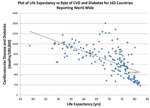
A negative correlation is present above: As cardiovascular (CV) diseases and diabetes rates decrease, life expectancy increases. However, the model underlying these results only explains 42 percent of the variation in the data — so the rest of the 58 percent of the variation is due to other factors not assessed here.
Additionally, if someone hands you a scatterplot with a linear fit line and there are no confidence intervals plotted along with a coefficient of correlation and coefficient of determination, throw it in the trash!
In Conclusion
Kaoru Ishikawa, our progenitor of the Fishbone Diagram observed, “The seven QC Tools, if used skillfully, will enable 95 percent of workplace problems to be solved.” The use of these tools also puts you in a position to be solving problems several hundred percent better than trying to do so without the appropriate use of the proper tools (this is called “gut instinct” or, alternatively, the ‘hope’ model of business strategy).
Quality, then, isn’t fixing everything. It’s solving what matters.* And you can only find those things by careful and scientific approaches, not guesswork and assumptions. So, you’ll read this and wonder what things matter most within your organization — and then you’ll need to distill the trivial many down to the critical few. The reality is that every organization is different, and while I could share the most common 12 quality-related issues that most companies don’t do properly, how you approach and solve these within your business is dependent largely on idiosyncratic org structures, business culture, etc. So, the only way to make it fit in your situation is to identify the key issues as I’ve described in this series and then work within the nuance of your company to make it stick.
In the case of Quality and Quality messaging, stickiness is a virtue.
Notes:
*There are many different variations of the 7 Tools of Quality, though many are similar. I chose these seven not because of their historical accuracy, but because of their relative ease of implementation and value of return to your business. The point isn’t which tools are the right ones, but rather which will work because you actually used them! The proper tools can’t help you if you don’t use them properly!
**Author’s expansion of the discussion: You’ll often hear me saying in group settings that “Perfect is the archenemy of good enough.” We can strive for perfection, both personally or professionally (though, side note: many fewer people strive for this personally), but perfection … she is an elusive creature. In fact, she’s the mathematical corollary of achieving “zero” (in terms of zero defects, zero accidents, zero errors, etc.).
It’s a fun aspirational goal for some people and some organizations, but it’s impossible on a long enough time horizon. Zero (or perfection) requires achieving a unitary state of improbability and then maintaining it with no variation. Ever. You’ll never do this, so don’t bother setting a stupid goal.
About The Author:
 Ben Locwin, PhD, MBA, MS, MBB, is a healthcare executive who has worked with regulatory authorities and organizations to bring the future of better Quality within reach. This work has transcended industries and has included work improving the quality of patient care in hospitals and emergent and clinical care centers, and improving quality in the aerospace, automotive, food and beverage, and energy sectors. Connect with him on LinkedIn and/or Twitter.