
Using Comic Books To Craft Effective Quick Reference Guides
By Sarah Fairchild, Core Human Factors Inc

Comic books are more popular than ever, raking in about $1 billion in North American sales in 2017.1 Sadly, visually-similar quick reference guides (QRGs) are less beloved, with many people proudly proclaiming “I never read the directions!”
Differences in popularity aside, there are obvious similarities between comic books and QRGs: both are collections of images with accompanying text presented in a sequential format. In both cases, readers need to integrate the images and text for each individual panel or instruction, and integrate successive panels in a specific order to understand the intended message — whether that message is a riveting narrative about Batman’s tragic backstory or a set of critical instructions for how to use a life-saving device. But, understanding how text and images fit together, and connecting successive panels, is no small feat. Even minor changes in the placement of text or the size of panels can foil a reader’s grasp of the material.
How can manufacturers avoid these pitfalls and construct user-friendly QRGs? Thanks to the huge culture surrounding comic books and Japanese manga, a rich body of work has emerged investigating the comprehension of visual narratives. In this article, we explain how some of the cognitive principles and theories resulting from this research can be straightforwardly applied to QRGs.
Suggestion #1: When In Doubt, Make It A Grid
I’m going to assume you’re reading this article the way the typical English speaker would, in a z-shaped path: from left to right until the end of the line, and then down to the leftmost side of the line below (Fig. 1). Because English readers have so much experience navigating a page in this way, the “Z” path is the general default for comprehending other types of material — QRGs and comic books included.
This path can be easily disrupted in these visual formats, but research2 shows that, when panels are arranged in a grid of perfect squares, nearly all individuals read in a “Z” path beginning with the top left. So, constructing your QRG with this layout can help you estimate where users will look next. Just make sure your grid doesn’t cross a page boundary - readers are likely to start again on the top left of the page if this happens.
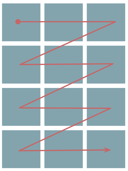
Fig. 1 — Grid layout that users would be expected to read in a “Z” path
Suggestion #2: Mind your columns
What if a grid of perfect squares isn’t achievable? Maybe you have one large image that needs to be included, and so you opt to use a layout like the one in Fig. 2. Researchers refer to a full-column panel — like “C” below — as a blockage, and it can cause major problems with comprehension. Will users read in an A-B-C order or A-C-B?
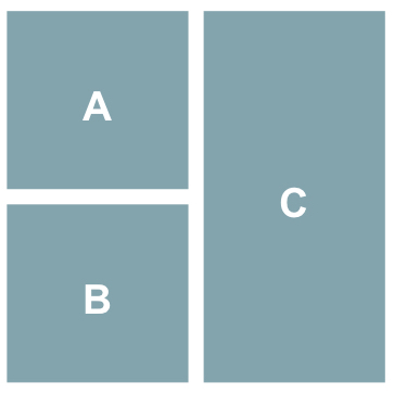
Fig. 2 — A grid layout with a “blockage”
It turns out, there is a lot of variation — about 70 percent of people surveyed2 preferred an A-C-B order, and eye-tracking research3 shows that a blockage is often skipped entirely. If it’s feasible, a more effective strategy is to take up an entire horizontal row for large images, rather than an entire column. This way, readers can stick to the default “Z” path.
Suggestion #3: Get To Know Your Gestalts
There is a set of cognitive principles, known as Gestalt principles (Fig. 3), that govern how people interpret objects and images. For example, people generally interpret objects that are very close together to be part of a single group (or a larger object). This is the Gestalt principle of proximity, an important rule to keep in mind when constructing QRGs; placing two instruction panels too far apart can cause confusion. For example, make sure step #2 is closer to step #3 than to step #5, or users can easily go astray.
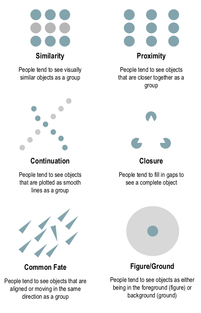
Fig. 3 — Summary of Gestalt principles
Other Gestalt principles, like the principle of similarity, can be helpful, too. If the goal is for users to make a connection between two items or steps in a QRG, use colors and shapes to make them as visually similar as possible.
Suggestion #4: Experience Matters. Who Are You Trying To Reach?
Knowledge of your intended user group doesn’t stop at usability testing! You should consider the abilities and experiences of users when creating QRGs, as well. For example, comic book fans are likely to read the layout in Fig. 2 in A-B-C order — the opposite of people who don’t read comics!
Language background is a particularly important factor to consider: material in the upper-left quadrant of a page is most memorable for readers of left-to-right languages, like English, but native Japanese speakers remember information in the upper-right quadrant best.4 The “Z” path also is reversed (i.e., from right-to-left until the end of the line, and then down to the rightmost side of the line below) for speakers of Japanese and other right-to-left languages, like Hebrew.
Suggestion #5: Incorporate Text Into Your Images
If your QRG contains both images and text, it’s helpful to combine both types of information. This cuts down on the work your reader has to do, allowing them to devote more mental energy to actually using the medical device to administer treatment. Research shows5 that an effective way to combine text and images is to integrate text into the “world” of the image.
For example, if you’re developing an app, consider showing an image of a phone with a screenshot of the actual messages a user might see in the app, rather than an image of a phone with a description of the messages underneath. If that is not feasible, try a speech bubbles with a line or “tail” connecting your text to a speaker within the “world” of the image.
When creating speech bubbles, it is helpful to consult the Gestalt principles for clarity: following the principle of proximity, a speech bubble should be placed as close to the “speaker” as possible to avoid confusion. Captions that are not connected to the world of the image are a last resort, as they are more difficult for users to integrate.
Conclusion
In conclusion, findings from research on comic book comprehension apply surprisingly well to the development of quick reference guides for medical devices. Structuring panels so that they can be read in a “Z” path and avoiding full-column panels can help readers follow important, step-by-step instructions. Incorporating Gestalt principles like proximity and similarity, and placing accompanying text within the “world” of an image also can help make a visual narrative easier to process, whether the main character is a superhero or a new medical device.
About The Authors
Sarah Fairchild is an Associate at Core Human Factors, Inc. She received her Ph.D. from the University of Delaware, following time spent researching the neural and behavioral correlates of language comprehension at Penn State University and Bangor University (UK). Her research has focused on how language processing interacts with social cognition, attention, and category formation. Sarah has also investigated how behavior is affected when linguistic descriptions of a device fail to provide a user with sufficient information – research that ultimately sparked her interest in usability and led her to a career in human factors.
References
- Comic book sales by year, via Comichron.
- Cohn, N. (2013a). Navigating comics: an empirical and theoretical approach to strategies of reading comic page layouts. Frontiers in Psychology: Cognitive Science, 4, 1-15.
- Omori, T., Ishii, T., & Kurata, K. (2004, August). Eye catchers in comics: Controlling eye movements in reading pictorial and textual media. In 28th International Congress of Psychology.
- Chan, T. T., & Bergen, B. (2005, July). Writing direction influences spatial cognition. In Proceedings of the 27th Annual Conference of the Cognitive Science Society (pp. 412-417).
- Cohn, N. (2013b). Beyond speech balloons and thought bubbles: The integration of text and image. Semiotica, 2013(197), 35-63.